JOHN WM. MACY’S
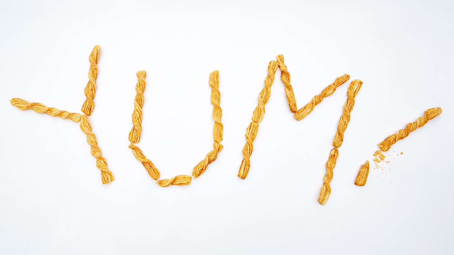
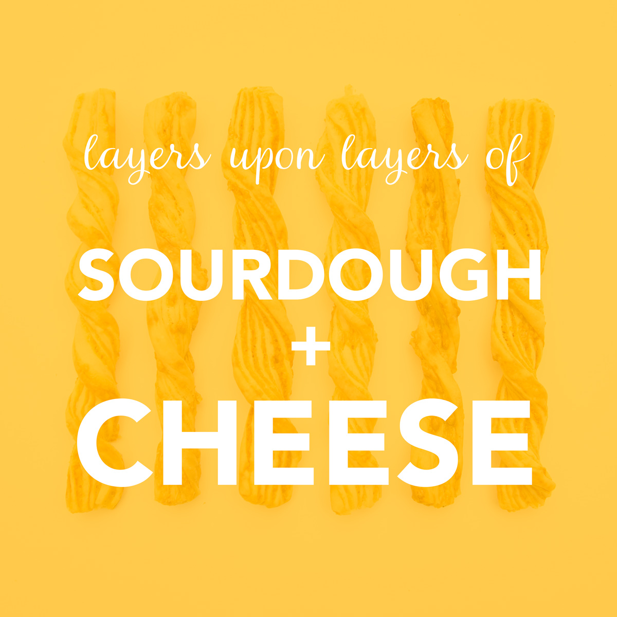
A family-owned, family-run high-end snack manufacturer, John Wm. Macy’s had been making their signature savory and sweet sourdough cheese twists for nearly 40 years. In that time, the company’s high quality products and personal attention to its customers garnered a fiercely loyal base of Cheesesticks lovers and shelf space in stores like Costco, Whole Foods, and Trader Joe’s.
Suddenly, John Wm. Macy’s saw its sales plateau as the rise in e-commerce specialty food sales forced them to compete against an influx of design-savvy boutique brands. In order to broaden their appeal and ensure the longevity of their brand, John Wm. Macy’s required a style update.
We started this rebrand from the ground up, focused on maintaining the rich history and nostalgia of the brand while polishing it with a modern, yet timeless appeal.

DELIVERABLES
Strategic consulting, Brand positioning, Brand redesign, Brand guidelines documentation
AWARDS
Gold Hermes Creative Award


BRAND/PRODUCT DISTINCTION
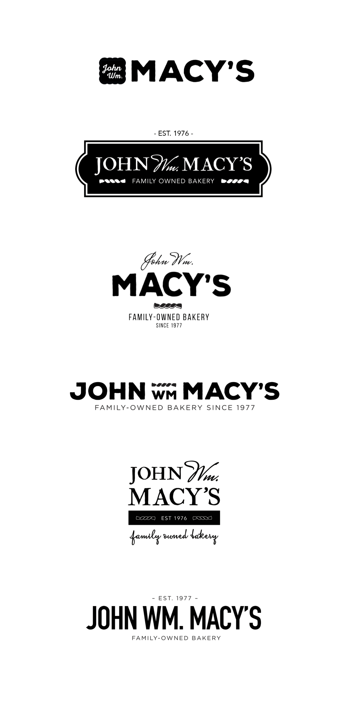
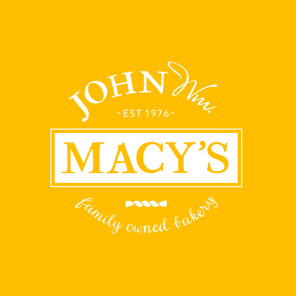
“John Wm. Macy’s CheeseSticks” is quite a mouthful. While this elegant snack food is delicious, the brand name was a little cumbersome. We sought to simplify the brand by separating the founder’s name from his product. The new parent brand “John Wm. Macy’s” can now more readily market its full range of crispy sourdough products such as SweetSticks and CheeseCrisps. The hand-made quality of this specialty food is reinforced with the important new brand attribute “Family Owned Bakery.”
LOGO EXPLORATION + DESIGN
Because the John Wm. Macy’s products have a higher price point than many of their competing snack products, each concept was designed to convey a level of sophistication while still remaining friendly and approachable. The “twist” device used in several concepts represents the twisted CheeseSticks and SweetSticks, while also referencing the nautical history of Martha’s Vineyard, where the CheeseStick was first introduced. The relative weight and prominence of ‘Macy’s’ – and whether to use the ‘Wm.’ at all – were ideas explored throughout the design process.


BRAND GUIDELINES
So much of the value gleaned from a strong brand is the recognition it garners from the marketplace. Without clear guidelines for a brand’s logical and consistent use across platforms customers become confused, and that recognition is dampened. We designed a thorough Brand Guidelines document to ensure the potency of the John Wm. Macy’s brand across all marketing and promotional media.


COLOR
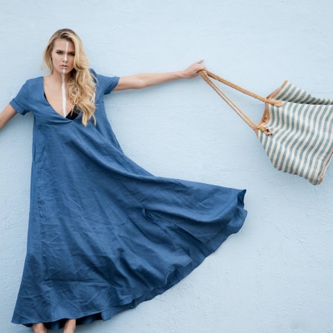
The powerful psychological influence of color over purchasing decisions is well-documented: over 80% of consumers regularly cite color as their main reason for buying a product. The color palette we created uses blues similar to earlier brand versions as a way to connect loyal customers to the new brand and inspire feelings of nostalgia. The palette also has a distinctly nautical feel, a reference to John’s early days catering on Martha’s Vineyard. It makes people think of sailing, the ocean, and summers by the sea – all happy and relatively affluent associations. The color blue expresses security, strength, trustworthiness, honesty and caring, while yellow denotes playfulness, optimism and confidence.
“The Scenic Route team opened our eyes to so much about our products and our brand we had never realized or understood.”
-Tim Macy, Vice President