CHRISTY’S

One of the few remaining vendors of analog film editing equipment, Christy’s also spearheaded the transition to digital film editing and was one of the most knowledgeable, technology-savvy digital and HD post solutions providers in the business.
While Christy’s continued to innovate to stay ahead of constantly evolving technology, the post-production industry failed to notice. Christy’s realized they had to reverse that misconception in order to remain competitive.
We set out to renew the company brand in a way that would honor their long history in the film post production industry, highlight their 21st century services and expertise, and land them lots of new clients.
DELIVERABLES
Brand Redesign, Brand Messaging, Copywriting,UI/UX Design + Development, Lifestyle + Portrait Photography, Art Direction, Ecommerce Design + Development
AWARDS
Gold MarCom Award
BRAND IDENTITY
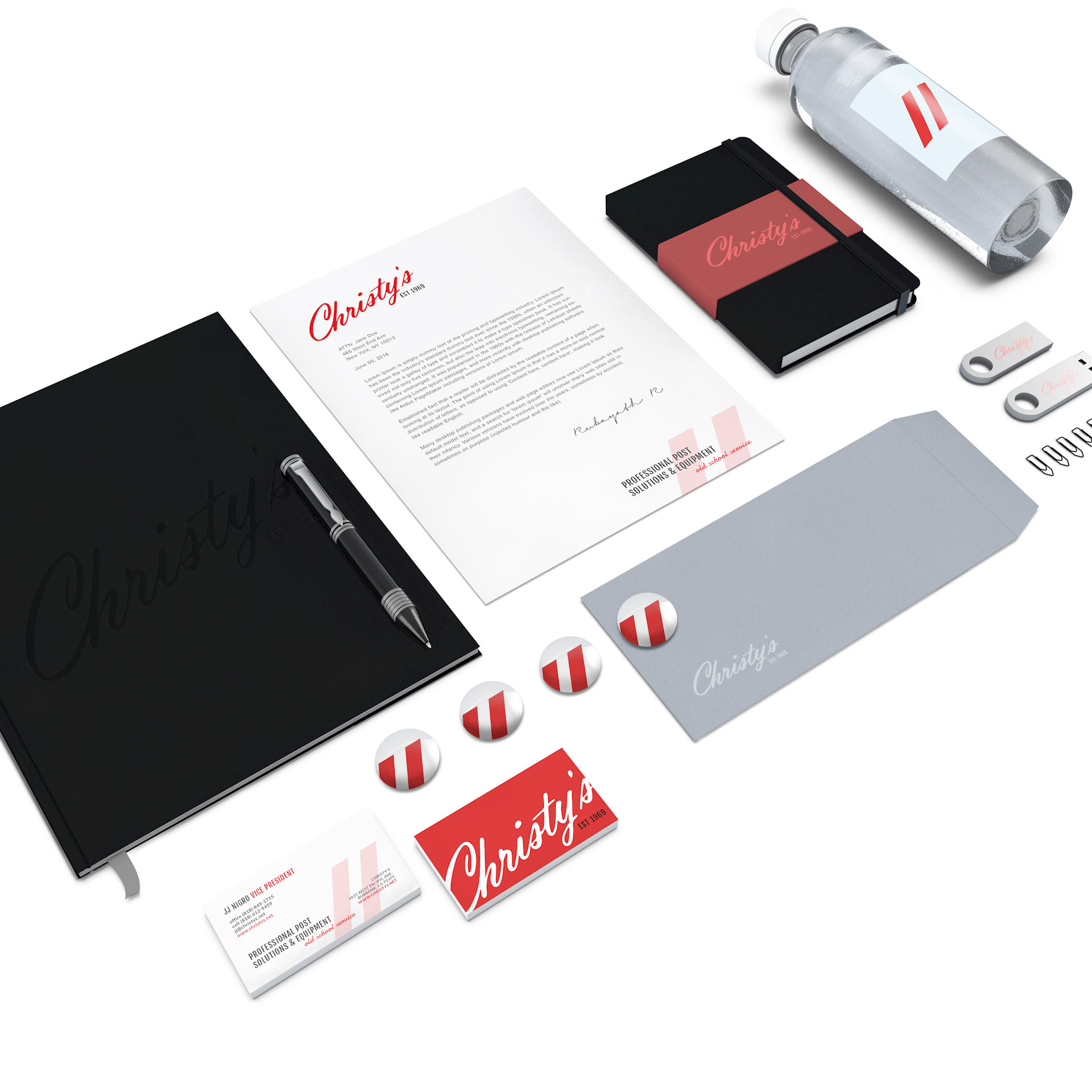
The Christy’s logo has seen several incarnations over the years, the most recent of which included a very literal interpretation of their hybrid business (a cube that combined a film strip and NTSC color bars). We set out to simplify the brand and convey the analog vs. digital, old vs. cutting-edge characteristics of the business by instead combining vintage and modern styles and elements. By refining the edges and overall shape of a hand-written Christy’s signature, we created a clean, classic brand that appeals to a younger demographic who may be unfamiliar with Christy’s, but are now moving into decision-maker positions at various post production companies.

BRAND STORYTELLING
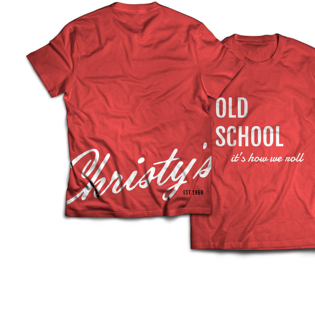
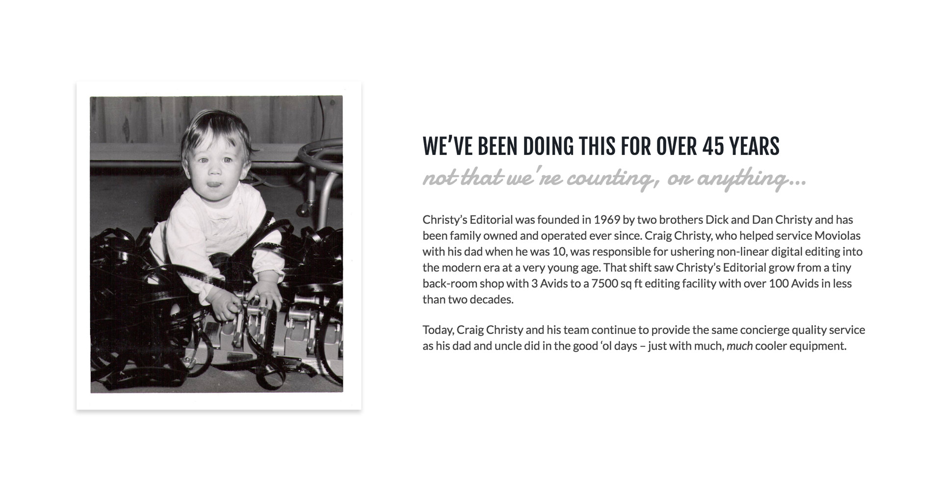
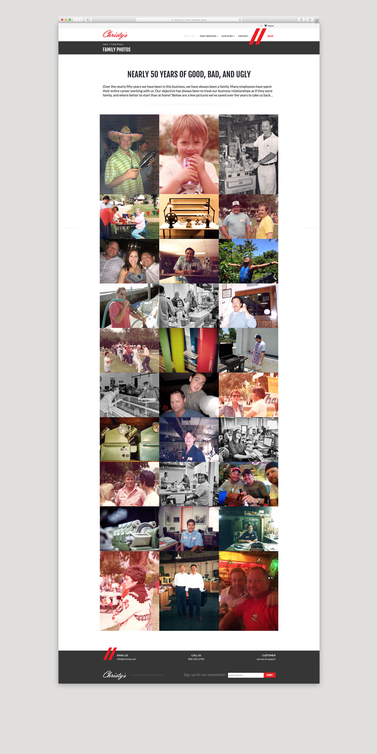
The Christy’s culture is the perfect intersection of playfulness and professionalism – office banter is filled with cheeky humor and savvy wit. On a whim, Craig Christy will whip out the barbeque and make his ‘gourmet’ lunch for everyone in the building…
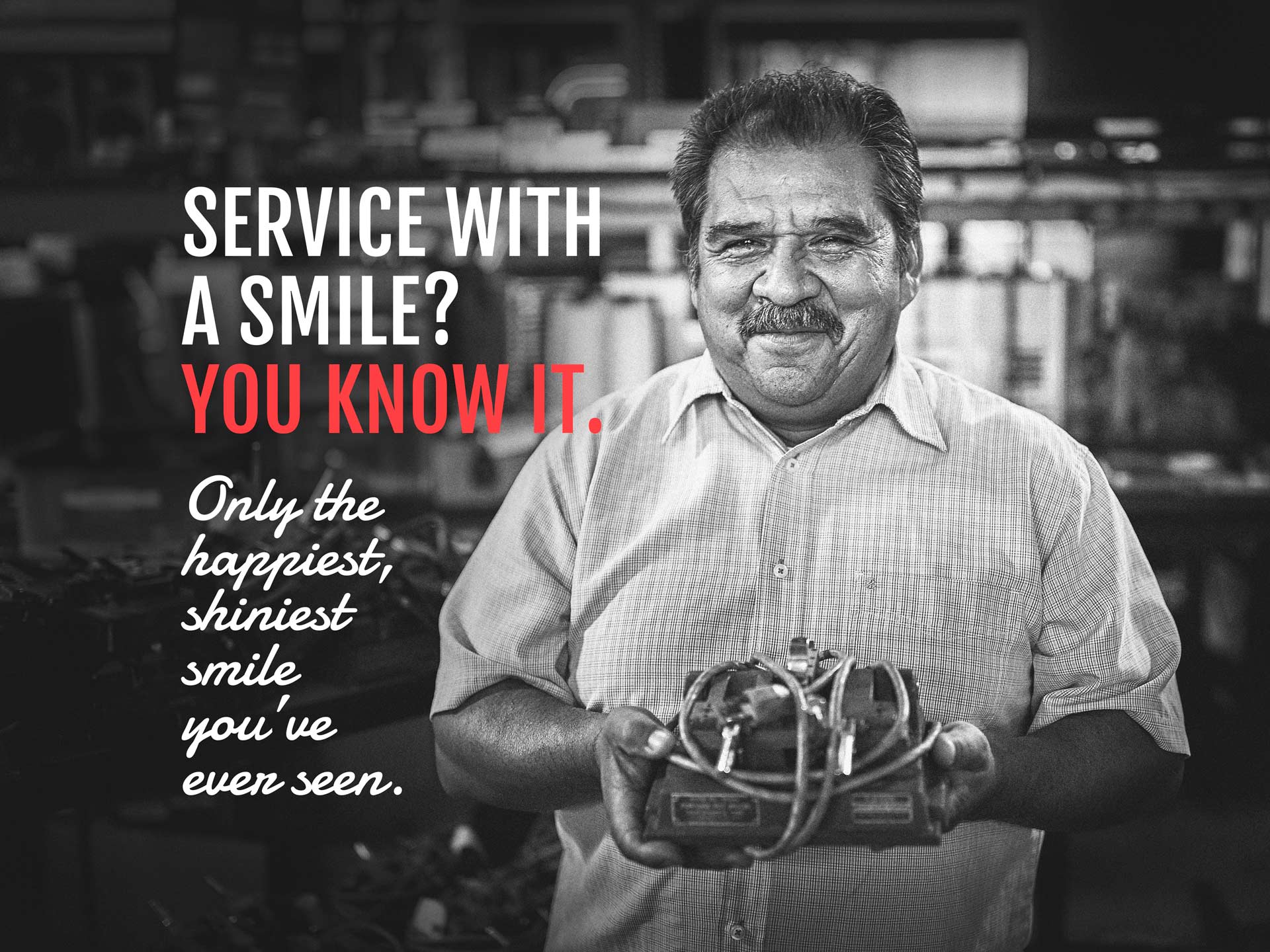
Christy’s employees are not just friendly with their clients: they are friends with them, and will go to great extremes to take care of their every need. This casual, playful attitude and uber-attentiveness inspired the voice for all of Christy’s new brand messaging and copy.
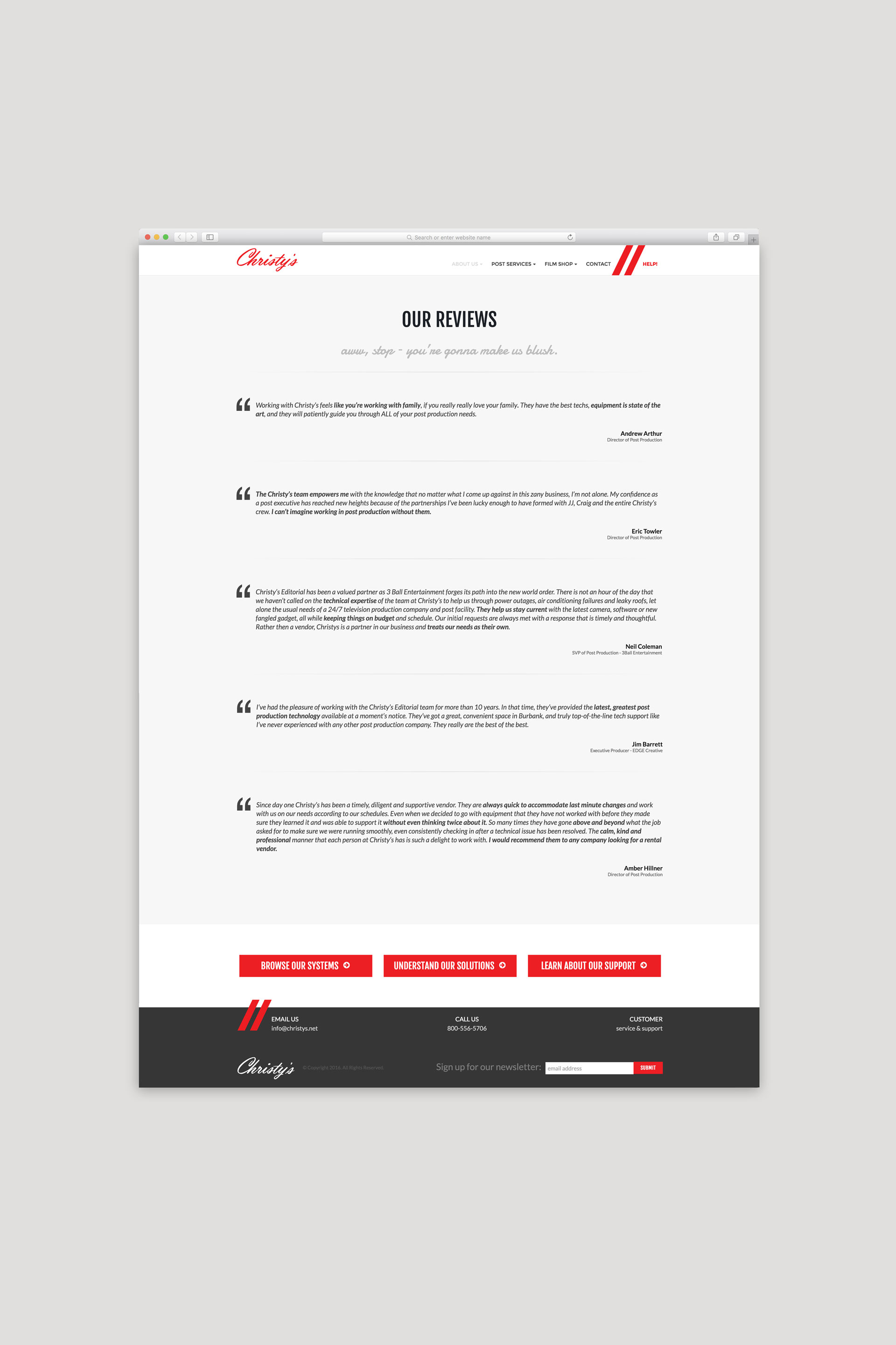
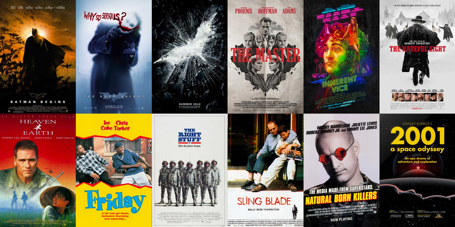
Client testimonials reinforce this impression, and motion picture credits validate claims of industry experience.


ART DIRECTION + PHOTOGRAPHY
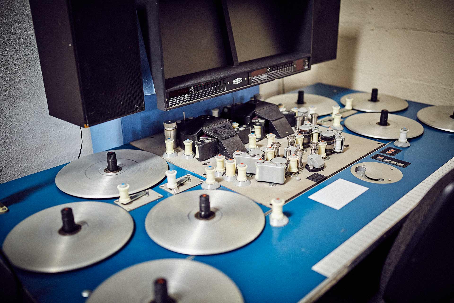
To compliment and reinforce our storytelling, we wanted to capture the Christy’s team, culture, and history in photographs. We directed and shot candid-style portraits of Christy’s employees in their work setting in order to best capture the atmosphere and spirit of the company. Details of old – sometimes nearly extinct – film editing equipment and tools paid tribute to the company’s longevity and deep experience within the movie and television editing industries.





UI/UX DESIGN + DEVELOPMENT
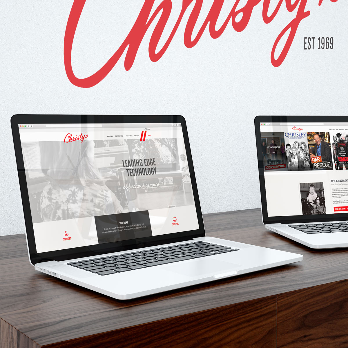
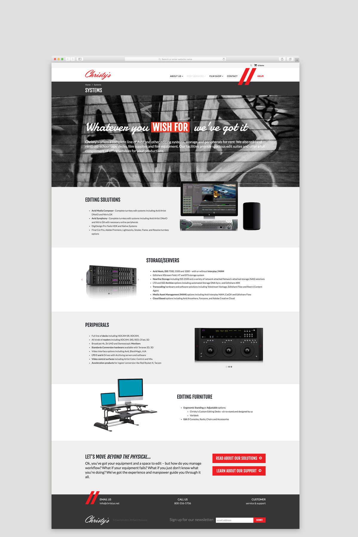
Originally just a landing page with a logo, address, and a link to a zencart store, we redesigned the Christy’s website to inspire exploration: clean layouts; succinct copy; lots of fun imagery; bold colored calls to action. Visitors are compelled to click through and read on about Christy’s. Every element of the overall design was intended to communicate the youthful and client-centric culture of the company as well as their well-established credibility in the field of digital and HD post production.

ECOMMERCE
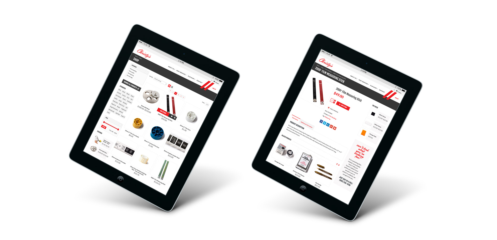
It was important that the design of the new online store be crisp, straightforward, and integrate seamlessly with the look and feel of the rest of the website. The modern, easy-to-use shop design reassures visitors considering sharing credit card details over the interwebs. Easy cart modification and seamless check out make for fun, hassle-free shopping.
